
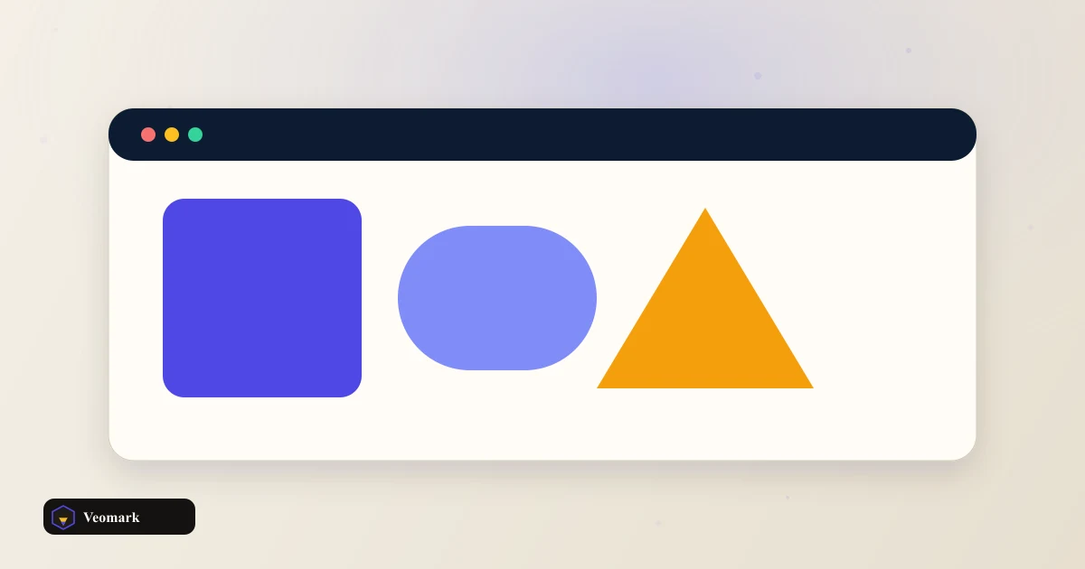


Four properties that define a flex container
Row direction, center justify-content, center align-items, and an 8px gap produce: display: flex;, flex-direction: row;, justify-content: center;, align-items: center;, and gap: 8px; -- a container that centers its children both horizontally and vertically along a horizontal row.
justify-content and align-items control two different axes: justify-content aligns items along the main axis (horizontal, since direction is row), while align-items aligns them along the cross axis (vertical, perpendicular to the main axis) -- both set to 'center' here is what produces true horizontal-and-vertical centering, a famously common CSS layout need that flexbox solves cleanly.
Switching flex-direction to column would swap which axis is 'main' and which is 'cross' -- justify-content would then control vertical alignment and align-items would control horizontal, since the main axis rotates with the direction property.
What this generator covers, and what's layered on top
Container rules only. Child flex-grow values are not generated. This produces the flex container's own properties -- it doesn't generate per-child properties like flex-grow, flex-shrink, or flex-basis, which control how individual items grow or shrink within the available space and need to be set separately on each child element.
flex-wrap (whether items wrap onto multiple lines when they don't fit in one row) isn't part of this generator's output either -- by default, flex items stay on a single line and can overflow or shrink rather than wrapping, unless flex-wrap: wrap is added.
gap: 8px; works consistently in flexbox the same way it does in Grid, applying spacing between items without needing older margin-based spacing hacks -- a relatively modern addition to flexbox that's now well-supported across current browsers.
Related CSS layout and sizing tools
For a two-dimensional layout with both rows and columns simultaneously, the CSS Grid Layout Builder is the more appropriate tool than flexbox.
For responsive font sizing to pair with this layout, the CSS clamp() Font Calculator handles that separately.
Frequently Asked Questions (FAQ)
Why do I need both justify-content and align-items set to 'center' to fully center content?
Because they control different axes -- justify-content aligns along the main axis (horizontal for a row direction), and align-items aligns along the cross axis (vertical for a row direction). Setting both to center achieves centering in both directions simultaneously.
What changes if flex-direction is set to column instead of row?
The main and cross axes swap -- justify-content would then control vertical alignment (since column makes the main axis vertical) and align-items would control horizontal alignment, the reverse of their roles in a row direction.
Does this generate flex-grow or flex-basis values for the child items?
No. Container rules only. Child flex-grow values are not generated. This only produces the container's own properties. Individual item behavior (how much each child grows, shrinks, or its base size) needs flex-grow, flex-shrink, or flex-basis set separately on each child.
Do flex items wrap onto multiple lines by default?
No, not unless flex-wrap: wrap is explicitly added, which this generator doesn't include by default. Without it, items stay on a single line and may overflow or shrink to fit rather than wrapping.
Is gap a well-supported property for flexbox?
Yes, in current browsers. It's a relatively more recent addition to flexbox (having originated in Grid) but is now broadly supported, providing a cleaner way to add spacing between flex items without older margin-based spacing workarounds.