

Ratio used
--
Free · Instant · No signup
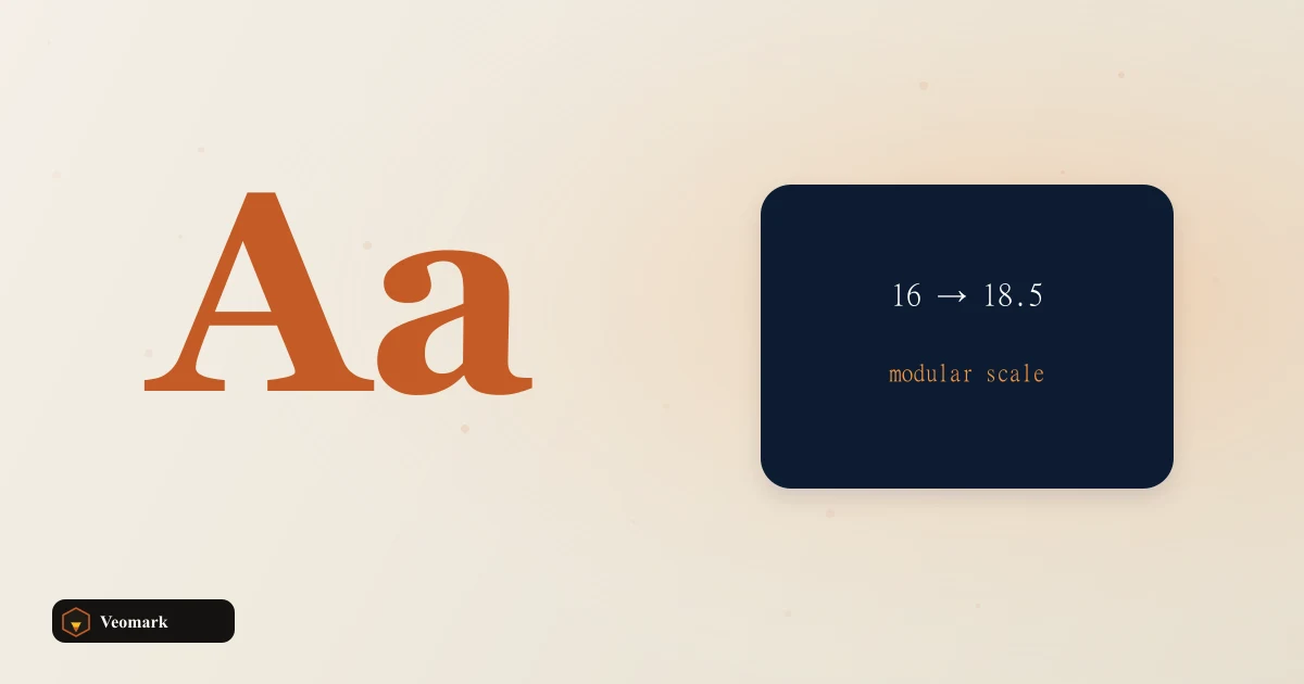
Six modular type sizes from a base pixel size and a ratio such as 1.25 or 1.618.
Page updated 2026-09-04.

Ratio used
--

Starting from a 16px base with a 1.25 ratio, the scale produces: xs 10.24px, sm 12.80px, base 16.00px, lg 20.00px, xl 25.00px, and 2xl 31.25px -- each step multiplying the previous size by exactly 1.25 (going up) or dividing by 1.25 (going down from base).
This is a geometric progression, not a simple additive one -- each step is a consistent multiplicative ratio away from its neighbor (16 x 1.25 = 20, 20 x 1.25 = 25, 25 x 1.25 = 31.25), which produces visually consistent, proportional jumps between sizes, unlike simply adding a fixed number of pixels at each step, which would feel proportionally larger at small sizes and smaller at large ones.
1.25 (sometimes called the 'major third' in musical-ratio-inspired naming conventions some type systems use) is a moderate, commonly used scale ratio -- a smaller ratio like 1.125 produces more subtle, closely-spaced size steps, while a larger ratio like 1.5 produces much more dramatic jumps between each step.
Geometric steps. Line length and viewport clamps are a separate pass. This calculates six fixed pixel values based purely on the mathematical ratio -- it doesn't address line length (how many characters fit comfortably per line at each size) or make these sizes responsive across different viewport widths, both of which are separate design and CSS considerations layered on top of this base scale.
A real production type system typically also needs corresponding line-height values for each size step (larger text generally needs a tighter line-height ratio, smaller text a looser one) -- this calculator produces the font-size scale specifically, with line-height as a related but separate calculation.
Six steps is a common, practical starting range covering everything from small print/caption text (xs) up to a prominent heading size (2xl) -- a design system needing even larger display headings would extend this same geometric progression further (continuing to multiply by 1.25 for additional steps beyond 2xl).
For making any one of these fixed sizes scale fluidly with viewport width instead of staying static, the Responsive Font Size Calculator is the direct next step.
For calculating an appropriate line-height to pair with any of these font sizes, the Line Height / Leading Calculator covers that related need.
Each step multiplies (going up) or divides (going down) the adjacent step by the ratio: base (16px) x 1.25 = lg (20px), lg x 1.25 = xl (25px), xl x 1.25 = 2xl (31.25px) -- a consistent geometric progression rather than fixed additive jumps.
A geometric scale keeps the proportional visual jump between sizes consistent at every step. An additive scale (adding a fixed pixel amount each time) would feel proportionally larger at small sizes and comparatively smaller at large sizes, producing a less visually balanced type scale.
Geometric steps. Line length and viewport clamps are a separate pass. No, it produces the font-size scale only. Line-height is a related but separate calculation, typically needing a tighter ratio for larger text and a looser one for smaller text -- a dedicated line-height calculator handles that.
No. Geometric steps. Line length and viewport clamps are a separate pass. These are fixed pixel values based purely on the ratio math. Making any of these sizes scale fluidly with viewport width is a separate step, typically using a clamp()-based responsive font-size calculation.
It would produce much more dramatic size jumps between each step -- a 1.5 ratio scale grows faster than this example's 1.25 ratio, resulting in larger visual differences between adjacent sizes like base, lg, and xl.
 CSS Text Shadow Code Generator One text-shadow layer from X, Y, blur, and color.
  WebP / AVIF Compatibility Cheatsheet & Preview Short Chrome, Firefox, and Safari support notes for WebP or AVIF so you can plan a picture fallback.
  Text Banner ASCII Art Generator Map A-Z, 0-9, and spaces into a three-row block banner. Does not convert a photo to ASCII.
  Color Picker from Image Sample colors from a canvas image.