


Six coordinate pairs, defining a hexagon shape
The hexagon preset generates: clip-path: polygon(25% 0%, 75% 0%, 100% 50%, 75% 100%, 25% 100%, 0% 50%); -- six percentage-based coordinate pairs tracing the six corners of a hexagon shape, clipping the element to show only the content inside that polygon outline.
Each pair represents an (x%, y%) point relative to the element's own box -- 0% is the left/top edge and 100% is the right/bottom edge, so (25% 0%) sits a quarter of the way across the top edge, and (100% 50%) sits at the exact vertical center of the right edge, tracing out the hexagon's six vertices in sequence around the shape.
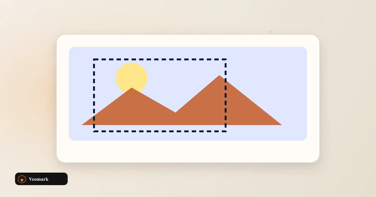
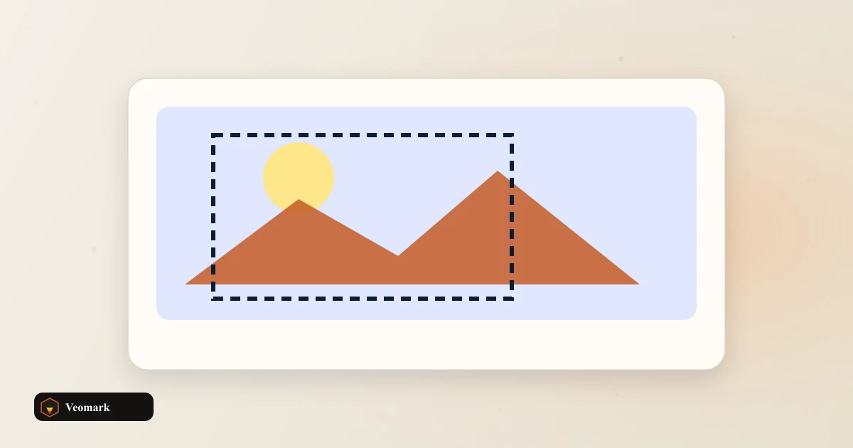
clip-path doesn't resize or reshape the element's actual box -- it only controls which parts of that existing box are visible, hiding everything outside the defined polygon while leaving the underlying box dimensions, padding, and layout behavior completely unchanged.
How custom points work, and their coordinate format
Percent points relative to the element box. Custom expects pairs like 0 0, 100% 0, 50% 100%. Beyond the built-in presets, entering custom coordinate pairs lets you build an arbitrary polygon shape of your own design -- each pair needs to follow the same x-then-y format (with or without a % sign, mixing both is allowed) separated by commas, tracing whatever custom outline you want the element clipped to.
Unlike the border-radius blob technique (which can only create smoothly curved organic shapes), polygon-based clip-path produces shapes with straight edges and sharp corners -- genuinely different visual possibilities suited to angular, geometric designs like hexagons, arrows, or custom cut-corner shapes rather than smooth blobs.
Points need to be listed in order around the shape's perimeter (either clockwise or counterclockwise consistently) for the polygon to render correctly -- listing them out of sequence would connect the dots in an unintended, likely self-intersecting or malformed order.
Related CSS shape and layout tools
For smooth, organic blob shapes instead of angular polygon shapes, the CSS Border-Radius Blob Builder is the related tool for that different aesthetic.
For a shape defined by smooth curves rather than straight polygon edges, the SVG Bezier Path Visualizer covers that curved-path alternative.
Frequently Asked Questions (FAQ)
What do the percentage values in each coordinate pair represent?
Each pair is an (x%, y%) point relative to the element's own box, where 0% is the left/top edge and 100% is the right/bottom edge -- the sequence of points traces out the polygon's vertices in order around the shape.
Does clip-path change the element's actual size or layout?
No. It only controls which parts of the existing box are visually visible, hiding everything outside the defined polygon shape -- the underlying box dimensions, padding, and layout behavior remain completely unchanged.
How do I create a custom shape instead of using a preset?
Percent points relative to the element box. Custom expects pairs like 0 0, 100% 0, 50% 100%. Enter your own comma-separated coordinate pairs in x-then-y format (with or without a % sign) tracing the vertices of whatever custom shape you want, in order around the perimeter.
What happens if I list the coordinate points out of order?
Percent points relative to the element box. Custom expects pairs like 0 0, 100% 0, 50% 100%. The polygon connects points in the exact order listed, so out-of-sequence points would produce an unintended, likely self-intersecting or malformed shape rather than the clean outline you intended.
How is a polygon clip-path different from the border-radius blob technique?
Polygon clip-path produces shapes with straight edges and sharp corners (like hexagons or arrows), while the border-radius blob technique produces smoothly curved, organic shapes -- genuinely different visual styles suited to different design needs.